Here’s a number: your p99 latency dashboard is probably wrong. Not slightly off — structurally, arithmetically wrong, in a way that makes it read better than reality.
It’s the most common metrics bug I run into, it survives code review because the code looks reasonable, and it comes from one mistake: treating a percentile like a quantity you can add up.
The arithmetic, with small numbers
A percentile is not a measurement. It’s a position in a sorted list. The p99 is the value at the 99th position out of 100, once you’ve lined everything up. Positions don’t add, and that’s the entire problem.
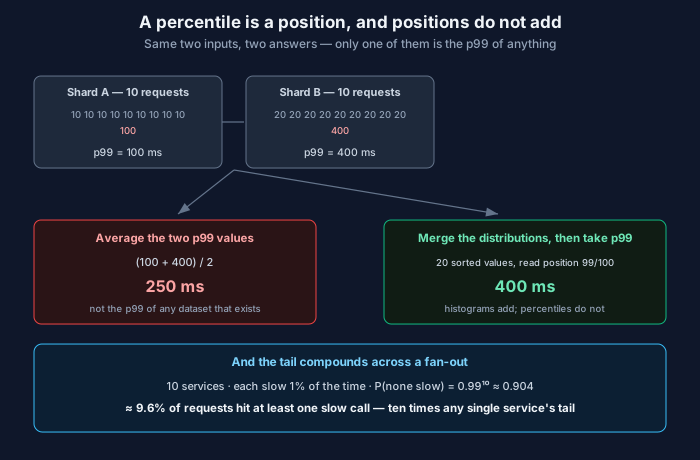
Take two shards. Ten requests each, latency in milliseconds, already sorted:
Shard A:  10  10  10  10  10  10  10  10  10  100
Shard B:  20  20  20  20  20  20  20  20  20  400
Say p99 of each is its slowest value — 100ms for A, 400ms for B. Your dashboard averages them and reports 250ms.
Now merge the raw data and sort all twenty:
10 10 10 10 10 10 10 10 10 20 20 20 20 20 20 20 20 20 100 400Twenty values. The 99th percentile sits at the top of that list — 400ms. Your dashboard said 250. It was off by 150ms, and it erred in the comfortable direction.
Now change one thing. Make shard B carry a hundred times the traffic. Shard A’s single 100ms outlier is now a rounding error in a sea of B’s requests, and the true p99 moves close to B’s — around 400ms. The average of the two p99s is still 250ms. Same reported number, completely different reality.
That’s the thing to take away: the error isn’t a fixed bias you could correct for. It depends on the relative volume and shape of the inputs, neither of which the two percentile values carry. There is no fudge factor. The number means nothing.
This applies anywhere you’re combining:
- p99 across shards or replicas
- p99 across regions
- the “average p99 over the last hour” that a time-series query gives you when it rolls up per-minute percentiles
- a per-endpoint p99 averaged into a service-level p99
That third one catches people constantly. Your metrics backend stored a p99 per minute. You ask for an hour. It averages sixty p99s and hands you something confident-looking. It’s the same bug with a nicer UI.
So how do you actually combine them
Aggregate the distributions, not the summaries. Then compute the percentile once, at the end, from the merged distribution.
In practice that means histograms. Instead of storing “p99 was 230ms,” you store bucket counts: 400 requests in the 0–10ms bucket, 900 in 10–25ms, and so on. Histograms do merge — adding two of them is adding their bucket counts, which is ordinary addition and works correctly across shards, regions and time.
The cost is resolution. Your percentile is only as precise as your bucket boundaries, so with coarse buckets you get “p99 is somewhere between 200 and 500ms.” Which is why the common implementations use exponentially-sized buckets: fine granularity where the values are small, coarse where they’re large, bounded relative error throughout. HdrHistogram does this, Prometheus native histograms do this, and t-digest takes a different route that keeps extra accuracy at the extremes — specifically because the extremes are the part you care about.
If you take one practical step from this post: find out whether your metrics pipeline stores histograms or pre-computed percentiles. If it’s the latter, every aggregation you do downstream is wrong, and no amount of careful dashboarding will fix it.
The measurement bug underneath the measurement bug
Suppose you fix all of the above and your percentiles are now computed correctly. They can still understate the tail badly, for a reason that has nothing to do with arithmetic.
Gil Tene named this one coordinated omission, and the name describes the mechanism precisely. Your load generator is supposed to send a request every 10ms. The system stalls for a full second. During that second the generator is blocked waiting on its outstanding request — so it doesn’t send the hundred requests it was scheduled to send.
When the stall clears, you record one request that took 1000ms. But a hundred requests should have been issued during that window, and they would have taken 1000ms, 990ms, 980ms, and so on down. Your dataset is missing ninety-nine slow measurements, and they’re missing precisely because the system was slow. The load generator and the system under test coordinated their pause. Hence the name.
The effect is large and always in the same direction: the worse the stall, the more measurements it suppresses. This is why a benchmark can report a tidy 5ms p99 for a service that visibly freezes for a second under load.
The fix is to measure each request against when it was supposed to be sent, not when it actually went out. Good load generators do this — wrk2 was written specifically to correct it, and HdrHistogram ships helpers for it. If you’re writing your own harness, this is the thing to get right, and it’s a few lines: record the intended send time up front, and compute latency from that.
The same trap exists in production, incidentally. If a queue backs up and your client-side timer only starts once a connection is acquired from the pool, you’ve omitted the queueing time — which is exactly the part that got bad. Start the clock when the work arrives, not when you get around to it.
Why your p99 is worse than everyone else’s p99
Here’s a calculation that reframes how you think about ownership of latency.
A request fans out to 10 backend services. Each one exceeds its latency threshold 1% of the time, independently. What fraction of your requests touch at least one slow call?
P(no slow call) = 0.99^10 ≈ 0.904
P(at least one) ≈ 9.6%
Every backend has a perfectly respectable 1% tail. Your user-facing request has a 9.6% tail. Nobody did anything wrong, and the end-to-end number is nearly ten times worse than any individual component’s.
Push it further. Twenty services at 1% each gives about 18%. And if the fan-out is sequential rather than parallel, the latencies add, so you’re not just more likely to be slow — you’re slower.
Two consequences I’d actually act on.
First, a per-service latency SLO is necessary and not sufficient. Ten teams can each hit their target while the composed experience misses badly, and the org chart will not surface this. Somebody has to own the end-to-end number.
Second, this is the honest argument for hedged requests — firing a duplicate to a second replica once the first exceeds, say, p95, and taking whichever answers first. You’re spending a few percent extra load to cut the tail, and because the tail compounds multiplicatively across a fan-out, that trade usually pays. It’s also why reducing fan-out width is a latency optimisation in its own right, which isn’t obvious until you’ve done this arithmetic.
What to put on the dashboard
Stop showing the mean. It’s not that averages are evil — it’s that the same mean comes from “everything takes 100ms” and from “most things take 10ms and a few take 4 seconds,” and your users are having completely different days in those two worlds.
Show p50, p95, p99 together. The spread between them is the signal. p50 flat while p99 climbs means a subset of requests found a bad path — a cold cache, an unlucky shard, a GC pause — and that’s a different investigation from all three rising together, which is saturation.
Keep a max, too. A max is a single sample and statistically almost meaningless, and it’s still the first thing I look at, because it tells you what this system is capable of doing to someone.
And write SLOs as percentiles with an explicit window: “99% of requests under 300ms over 30 days.” That composes into an error budget you can actually spend, which an average never will. If you want the full treatment of that, it’s in SLI, SLO, SLA, and error budgets.
One last thing. When you set the threshold, look at where your distribution is multimodal rather than picking a round number. Most real latency distributions have humps — cache hit, cache miss, cache miss plus contention. A threshold that lands in the valley between two humps is stable and meaningful. One that lands on a slope will flap, and you’ll spend a quarter tuning the alert instead of the system.
Related: Queueing Theory for SREs: Little’s Law and the Utilisation Knee · SLI, SLO, SLA, and error budgets · Garbage Collection: The Convenience That Shows Up in Your p99
Comments